
Case Study 02 · Spok Mobile
In a hospital, a delayed message isn't just inconvenient. It can cost a life.
How redesigning a clinical messaging app reduced communication delays by 40% — and put patient care back on track.
Sole UX Designer
Jan – Sep 2017
iOS / Android
2 Eng · 2 QA · 1 A11y · 1 BA
Mobile UX
Healthcare
User Research
Prototyping
HIPAA
iOS/Android
Where it started.
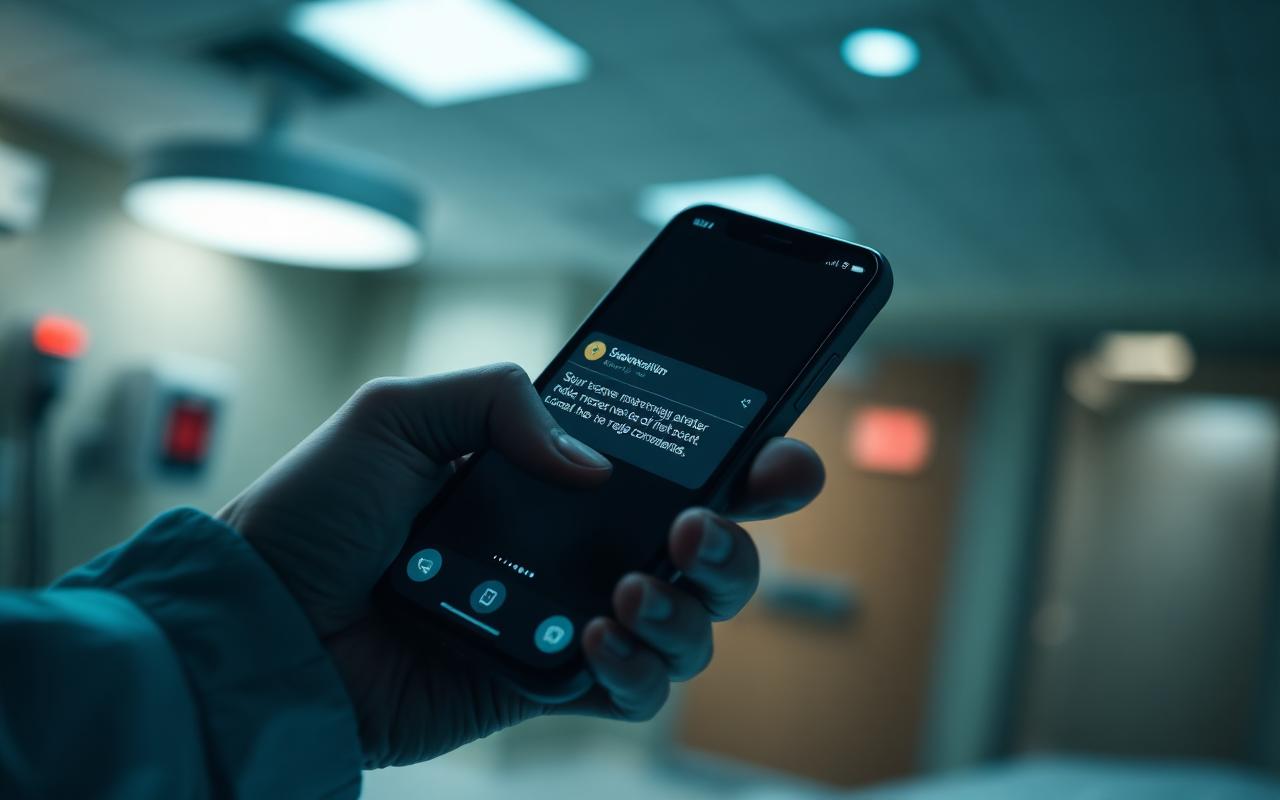
Doctors, nurses, and clinical staff were relying on a messaging app that worked against them. Urgent code warnings got buried in cluttered inboxes. On-call schedules didn't sync. New staff couldn't figure it out — so they gave up, fell back on slower methods, and gaps opened in patient care.
The consequences weren't just operational. Delayed consultations. Miscommunicated critical alerts. Coordinated care that broke down exactly when it mattered most.
"The problem wasn't that clinical staff didn't want to communicate well. The tool they were given made it nearly impossible."
Listening before designing.
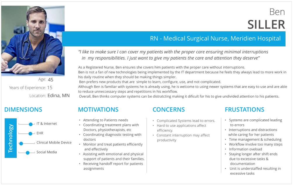
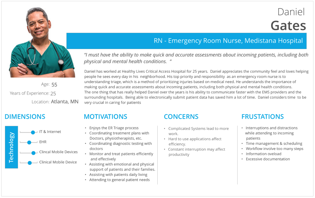
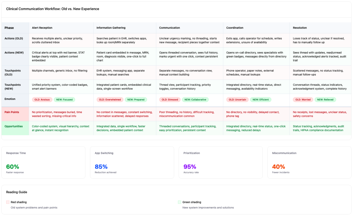
I embedded with the people using the app — shadowing nurses on rounds, sitting with doctors during shift changes, and interviewing staff about their most stressful communication moments. I built personas for doctors, nurses, and clinical staff, and mapped the full clinical messaging journey from alert to care delivery.
From discovery to ship.
Discover & Research
Shadowing sessions, interviews with clinical staff, persona building, and full clinical messaging journey mapping.
Ideate & Wireframe
Low-fidelity explorations focused on message prioritization, intuitive navigation, and role-based communication flows.
Prototype & Test
Interactive prototypes for 1:1 and group clinical conversation flows, tested with clinical users in context.
Build & Ship
WCAG and HIPAA-compliant high-fidelity designs with full engineering and QA partnership.
The people behind the work.
What we built.
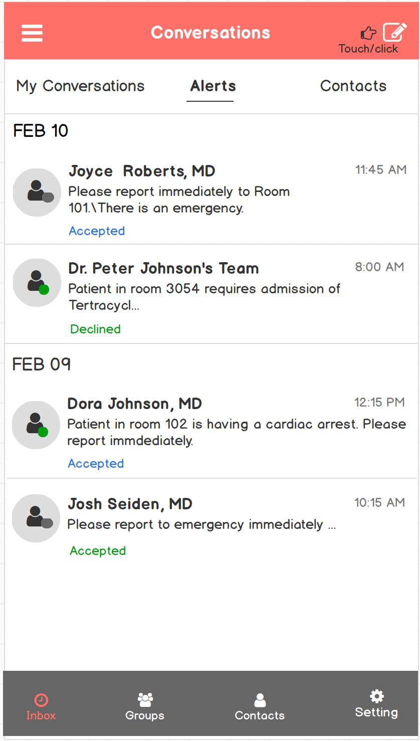
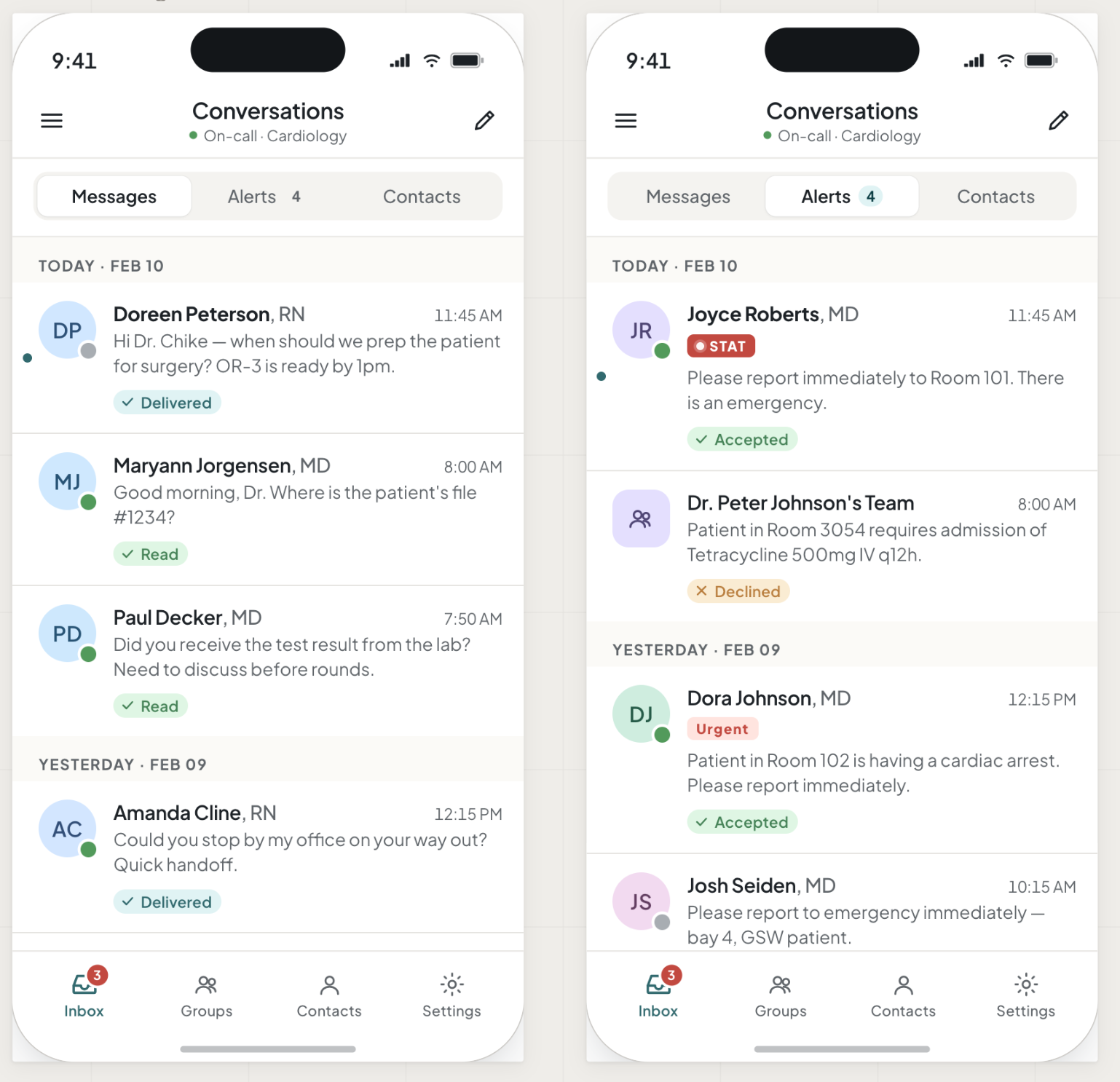
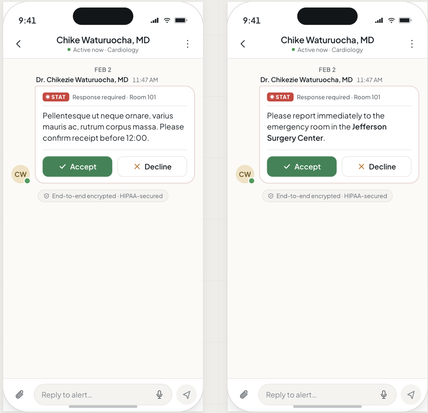
The new app was built around one principle: urgent things need to feel urgent. Color-coded message tags made code warnings impossible to miss. A redesigned bottom navigation matched the way clinical staff actually move - fast, often one-handed, mid-task. Better EHR and on-call scheduling integration meant the app finally worked with clinical systems instead of alongside them.
Journey map
Wireframes
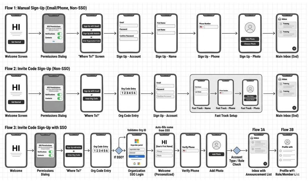
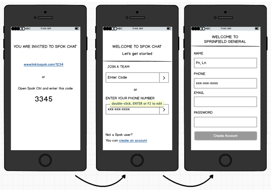
Onboarding screens
Alerts tab
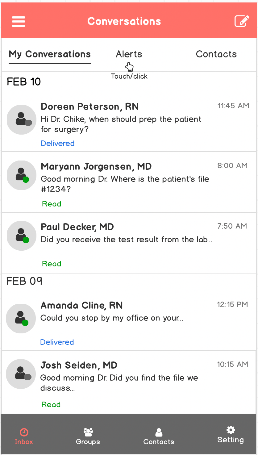
Conversation tab
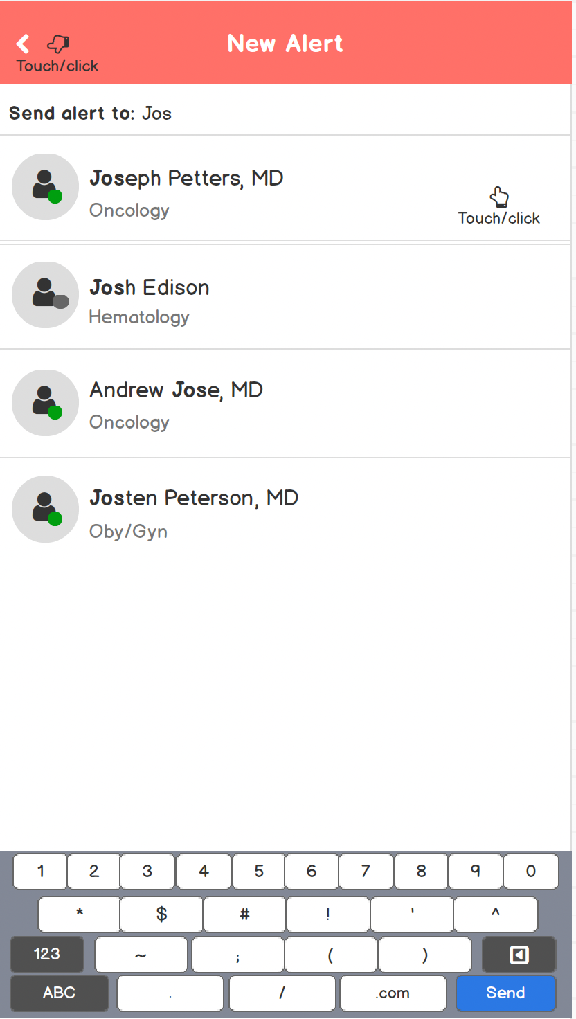
New alert
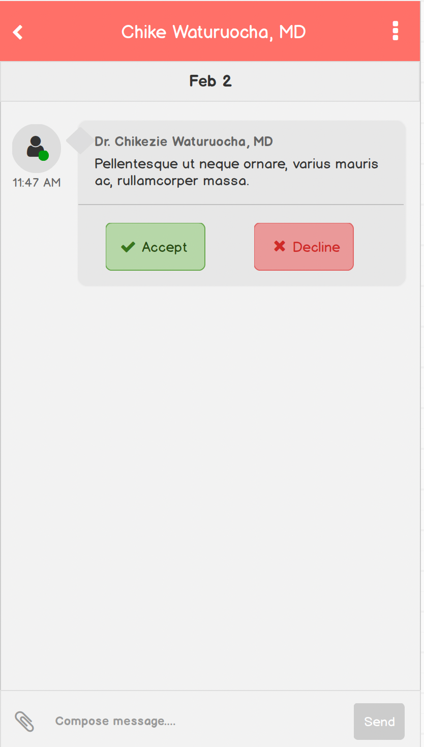
Custom alert - pending
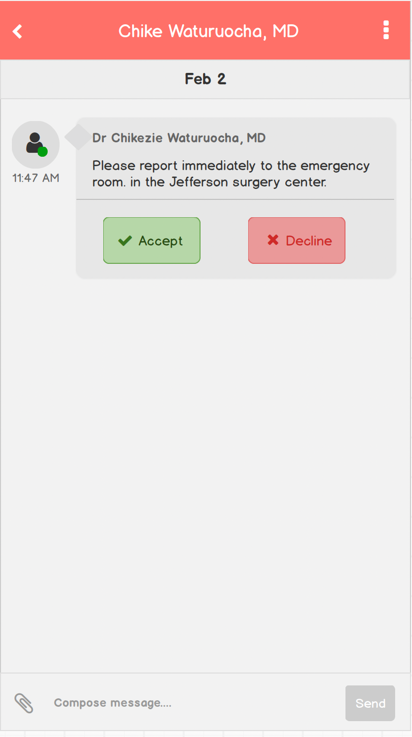
Free text alert
Mockups
Measurable outcomes.
High-stakes environments demand high-empathy design. When you understand the most stressful moment a person faces in their workday and design for that, everything else follows. The best UX doesn't just reduce friction. It removes the conditions that make failure likely.
Mobile UX
Healthcare
User Research
Prototyping
HIPAA
iOS/Android