
Case Study 01 · HealthPartners
21,000 employees. One intranet. Zero reasons to use it.
Discover how a complete redesign of the intranet homepage transformed a tool that was once overlooked by leaders and employees into an indispensable resource they now rely on daily.
Lead UX Designer
Apr – Dec 2024
SharePoint Intranet
2 Eng · 2 QA · 1 A11y · 1 BA
User Research
Information Architecture
SharePoint
WCAG
Personalization

Where it started.
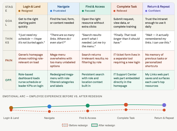
Healthcare professionals are constantly pressed for time. Yet, each day, nurses scramble to find their schedules, leaders sift through KPIs, and IT teams are overwhelmed with support requests — all while navigating an intranet that feels cluttered and impersonal, leading many to simply abandon it.
The homepage offered the same experience to a nurse, a finance director, and a new employee. It lacked personalization, provided no quick access, and featured a search bar that only led users in circles.
"People don't abandon tools because they're lazy. They abandon them because the tools were never built for them."
Listening before designing.
I ran card sorting sessions and tree testing exercises with real employees, observing how they actually moved through the intranet — where they clicked, where they hesitated, where they gave up. Interviews revealed four core themes: role-based content gaps, navigation overload, poor task efficiency, and low trust in search.
From discovery to ship.
Discover & Research
User interviews, surveys, card sorting, tree testing, and behavioral analysis across multiple employee roles.
Ideate & Wireframe
Low-fidelity layouts for personalized navigation — iterated with stakeholders and cross-functional teams.
Prototype & Test
Interactive prototypes for key flows: search, My Links, role/location switching, and audience targeting, and usability testing.
Build & Ship
WCAG-compliant high-fidelity designs with weekly dev reviews, QA partnership, and detailed handoff specs.
The people behind the work.
Sarah T., RN
Bedside Nurse · 5 yrs
"I just need to find my schedule and get back to my patients."
- ›Find training deadlines fast
Mark D.
Operations Director · 8 yrs
"I need to see KPI data and share it with leadership — but it takes me 20 minutes to find it."
What we built.
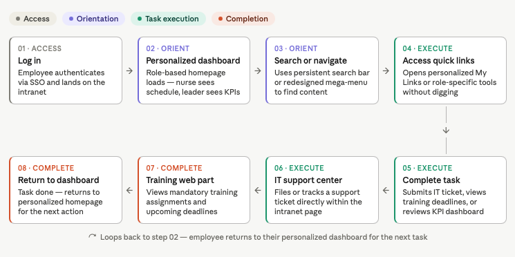
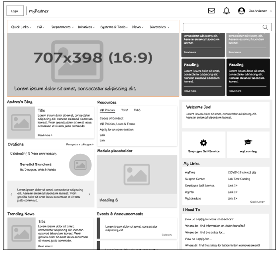
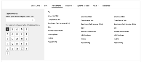
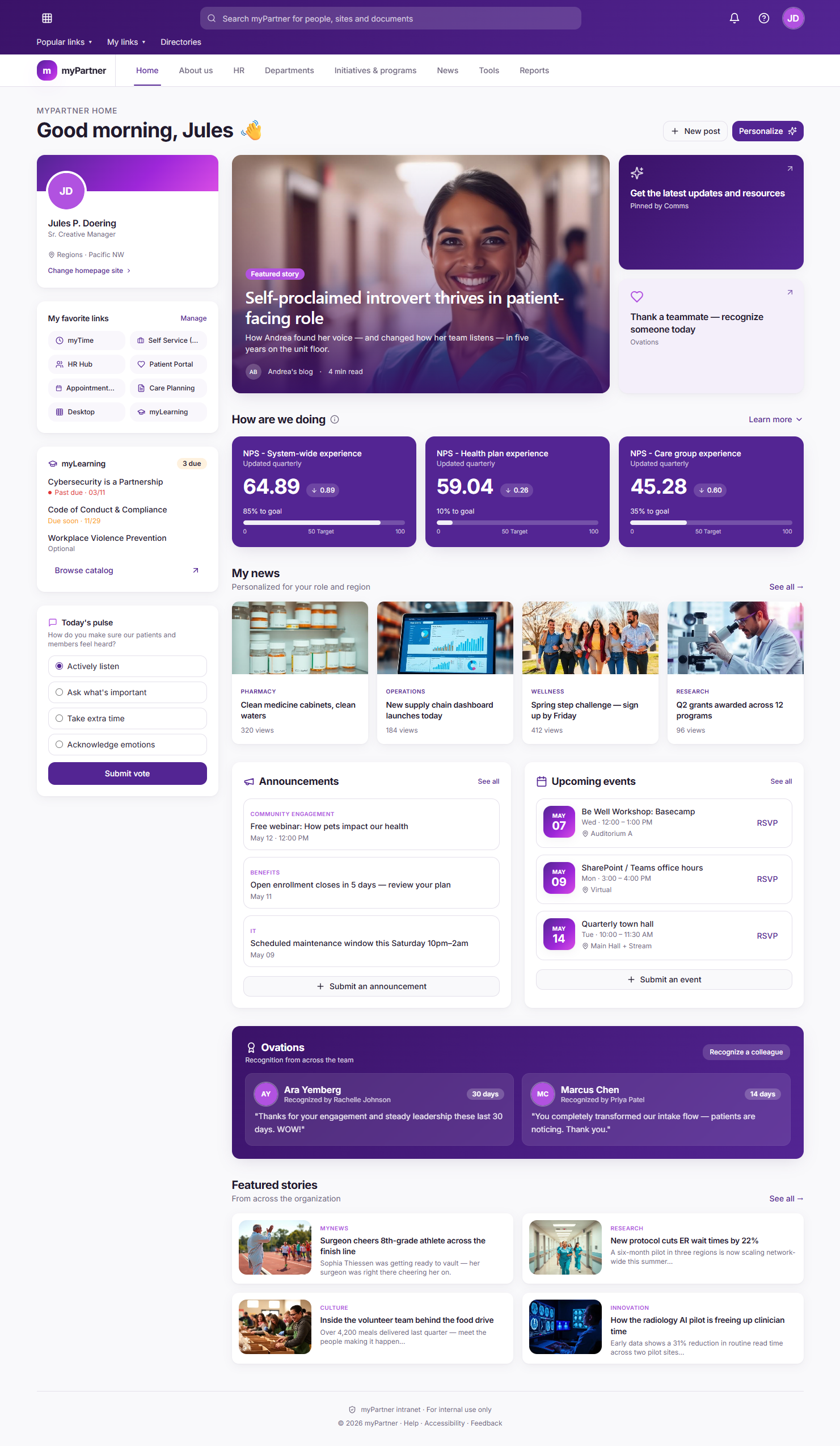
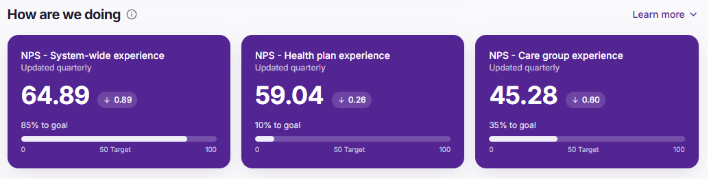
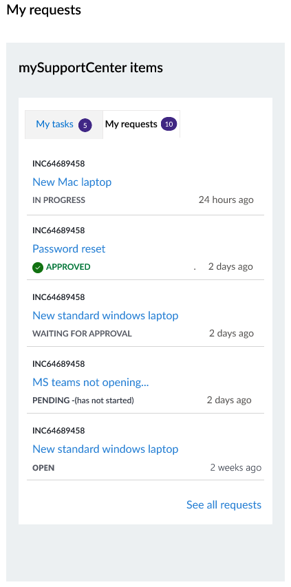
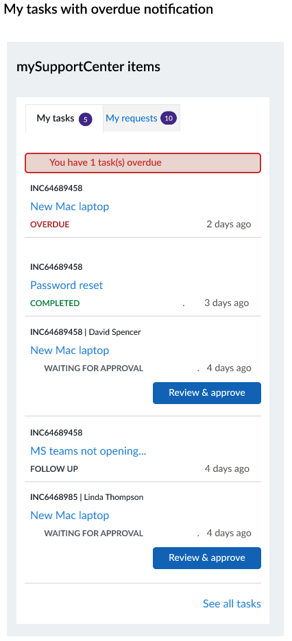
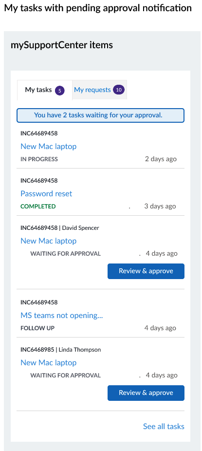
The new homepage knows who you are. Nurses see schedules. Leaders see org-wide KPIs. Finance teams see pending approvals without digging. A redesigned mega-menu cleared years of navigation clutter, and a new IT Support Center web part let employees file and track tickets without leaving the page.
User Flow
Journey Map
Wireframes
Intranet homepage
Mega menu
High fidelity designs
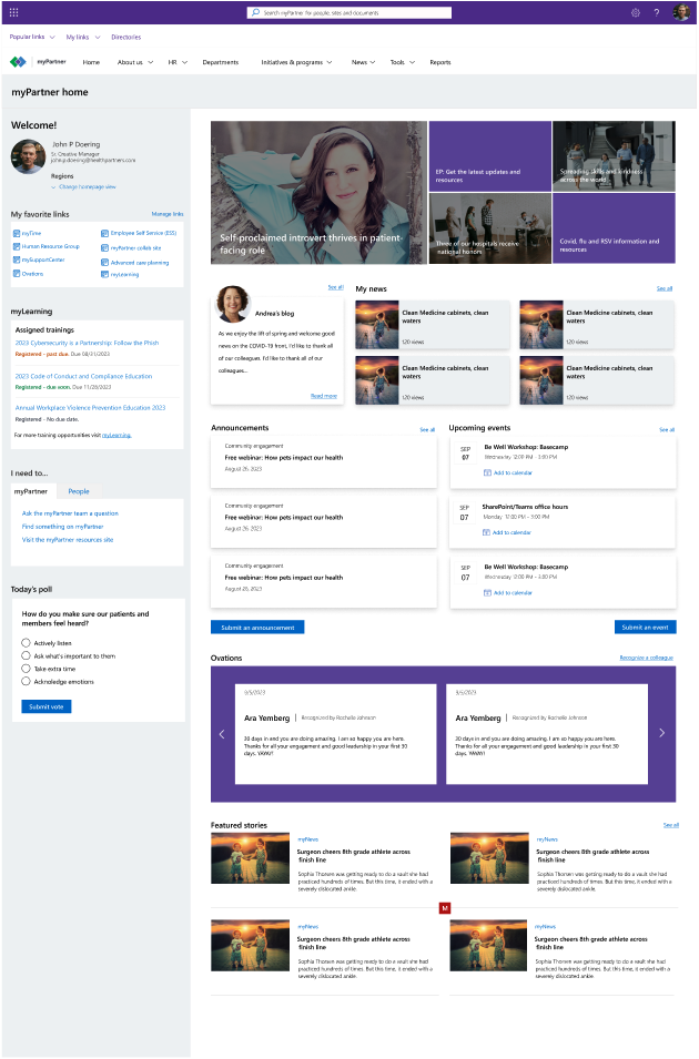
Home page - Initial design
Home page -final design
Org-wide KPI dashboard
My SupportCenter
Measurable outcomes.
Good UX isn't about making things look better. It's about making people feel seen. When the intranet finally reflected the reality of who was using it, adoption didn't just improve. It nearly doubled.
User Research
Information Architecture
SharePoint
WCAG
Personalization